#15 CSS animation 속성
2022. 2. 17. 01:06ㆍCSS
@keyframes
- css 애니메이션의 keyframe을 지정하는 규칙
- 선택자를 사용하지 않는다.
- keyframe의 지점은 from/to를 사용하거나, 해당 지점의 %를 지정하여 사용할 수 있다.
- 같은 지점의 keyframe이 중복되어 정의된 경우 마지막 선언 값만 적용된다.
- keyframe에서 !important 속성은 무시된다.
@keyframes animation-name {
  from {property: value;}
  to {property: value;}
}
animation-name
- 애니메이션의 이름을 지정하는 속성
animation-duration
- 애니메이션의 1회 지속 시간을 지정하는 속성
- s(초), ms(밀리초) 단위를 사용한다 (1s = 1000ms)
animation-delay
- 애니메이션의 지연 시간을 지정하는 속성
- s(초), ms(밀리초) 단위를 사용한다 (1s = 1000ms)
animation-iteration-count
- 애니메이션의 재생 횟수를 지정하는 속성
animation-direction
- 애니메이션의 재생 방향을 지정하는 속성
- 속성 값
- normal : 정방향 재생 (default)
- reverse : 역방향 재생
- alternate : 처음에 정방향으로 재생 후 역방향으로 재생
- alternate-reverse : 처음에 역방향으로 재생 후 정방향으로 재생
animation-timing-function
- 애니메이션의 가속도를 지정하는 속성
- 속성 값
- ease : 중간으로 갈수록 속도가 증가하다 끝에서 느려진다 (default)
- linear : 처음부터 끝까지 균등한 속도
- ease-in : 느리게 시작하여 속도가 점점 증가한다
- ease-out : 빠르게 시작하여 속도가 점점 느려진다
- ease-in-out : 천천히 시작하여 속도가 빨라졌다가 다시 느려진다
- cubic-bezier(n, n, n, n) : 3차 베지어 곡선 값에 따른 속도
animation-play-state
- 애니메이션의 재생과 중지를 지정하는 속성
- 속성 값
- running : 재생 (default)
- paused : 중지
div {
  position: absolute;
  left: 10px;
  width: 100px;
  height: 100px;
  background-color: lightcoral;
  animation-name: change_box;
  animation-duration: 2s;
  animation-delay: 1s;
  animation-iteration-count: 3;
  animation-direction: alternate;
  animation-timing-function: linear;
}
@keyframes change_box {
  0% {left: 10px}
  50% {width: 30px; height: 30px;}
  100% {left: 300px}
}
animation-fill-mode
- 애니메이션이 재생 전과 후의 스타일을 지정하는 속성
- 속성 값
- none
- forwards : (전) 기본값 (후) 마지막 keyframe에 정의된 값
(마지막 재생이 정방향 재생 시 : 100% or to / 역방향 재생 시 : 0% or from) - backwards : (전) 첫 번째 keyframe에 정의된 값 (후) 기본값
(첫 번째 재생이 정방향 재생 시 : 0% or from / 역방향 재생 시 : 100% or to) - both : (전) 첫 번째 keyframe에 정의된 값 (후) 마지막 keyframe에 정의된 값
<div class="none">none</div>
<div class="forwards">forwards</div>
<div class="backwards">backwards</div>
<div class="both">both</div>
div {
position: absolute;
left: 10px;
width: 100px;
height: 50px;
background-color: gold;
border-radius: 5px;
text-align: center;
animation-name: change_color;
animation-duration: 2s;
animation-delay: 1s;
animation-iteration-count: 1;
}
.none {
animation-fill-mode: none;
}
.forwards {
left: 120px;
animation-fill-mode: forwards;
}
.backwards {
left: 230px;
animation-fill-mode: backwards;
}
.both {
left: 340px;
animation-fill-mode: both;
}
@keyframes change_color {
from {
top: 10px;
background-color: pink;}
to {
top: 300px;
background-color: green;
}
}
★ animation 속성 축약형
- name 속성과 duration 속성은 필수이며, 지정하지 않은 속성은 기본값으로 적용된다.
- name 속성은 맨 처음이나 맨 뒤에 올 수 있으나 나머지 속성들은 순서를 지켜야 한다.
animation : name duration timing-function delay iteration-count direction fill-mode play-state;
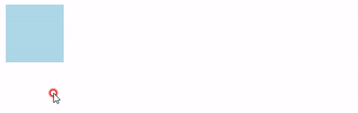
div {
  position: absolute;
  left: 10px;
  width: 100px;
  height: 100px;
  background-color: lightblue;
  animation: change_box 3s linear 1s 2 alternate;
}
div:hover {animation-play-state: paused;}

@keyframes change_box {
  0% {left: 10px}
  100% {
    left: 500px;
    background-color: lightpink;
  }
}
반응형
'CSS' 카테고리의 다른 글
| #17 CSS content 속성 (0) | 2022.02.22 |
|---|---|
| #16 CSS counter 속성 (0) | 2022.02.18 |
| #14 CSS transition 속성 (0) | 2022.02.15 |
| #13 CSS transform 속성 (0) | 2022.02.11 |
| #12 CSS 그림자 속성 (0) | 2022.02.11 |